


Dew Tour has been a pillar for MTN DEW for going on 20 years - This competition has always been executed with a high level of thought and creativity - When I first came onto the Dew design team my manager and I were tasked with ideating on how we could re-strategize Dew Tour moving forward - How can we bring this more in-house to manage the process of the event - from concept to execution and to maintain brand voice throughout all deliverables being executed across multiple teams. All this is done in collaboration with our outside partners who have been rocking Dew Tour for years, without their insight/care the strategy wouldn’t have flown.
Our strategy started with the locale, Dew Tour is a traveling competition bouncing from venue to venue with changing creative - We wanted to move the development of VIS toward being locale-specific, to create excitement and a point of pride that Dew Tour was coming. This starting point and research have informed the lense that we used when developing the new way of working in creating the Dew Tour visual footprint.
From that starting point we began diving deeper into the needs of Dew Tour and how can we serve the brand and make life easier across the multiple teams -
The VIS strategy became:
Research the area
Develop a narrative
Concept a key Visual+Wordmark
Develop VIS toolkit from that key visual
- Color palette
- Patterns
- Characters
- Main Character
- Product illustrations
- Background
- Environmental elements
This toolkit gave all teams the teams the pieces they needed to create assets as needed, keep consistency across multiple touchpoints, and maintain some real badass visuals to bring consumers to Dew Tour wherever they might be.
In the below case study, points of interest are shown that made up big parts of the overall deliverables for Copper Mountain 2023 Dew Tour. The breadth of assets created is so wide some pieces have been cut for your sake.
Everyone involved in Dew Tour is amazing to work with and are outstanding people that I am happy to be able to call my colleagues and friends.
Senior Director, Design: Rob Salit • Design Senior Manager: Louis De Villiers
Designer : Sam Cardelfe
Senior Motion Designer: Sam Wolfson
Agency Partners:
FUSE:
Issa Sawabini
Julie Jatlow
Mark Heitzinger
Scott Rivers
Lauren Machen
Sam Watson
Kelly Tailor
Maeve Looney
Cameron Savage
Alex Hughes
C375:
Christian Thomas
Oswaldo Sanchez
Chris Ortiz
Kemp Curley
This being a snow (a lot of white flanking everything) competition and a resort with a spread out event space we wanted the color palette to POP from afar - Balancing out the greens with the pink we established a base color palette that was bold but didn’t washout the brand - all elements of the event would reflect.
Dew Tour has always created unique locale-specific wordmarks to brand their events - Pulling from what Dew Tour has done in the past we gave structure to the development of the wordmark by creating a guideline for it’s creation.
The DEW TOUR wordmark with the D at the end had to lock to the top of the overall mark.
The overall mark had to work both horizontally and vertically/stacked
Some of the wordmarks in the past had minimal flexibility of use and we felt that we could streamline this issue.
This mark was developed by myself and Louis De Villiers
All iterations not here*
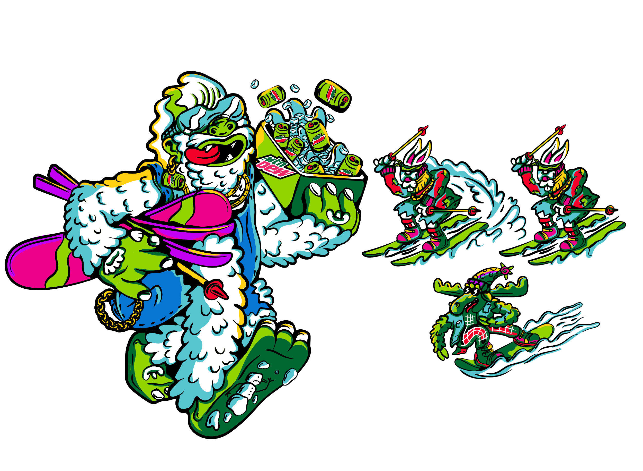
From the key visual, we isolated characters and environmental elements into a toolkit that can be leveraged by outside agencies supporting the event.
Pulling from the established key visual we pulled patterns and showed how the background would work alongside these continuous patterns
Circle K is one of MTN DEW’s customers that we’ve created exclusive customer flavors for (*Purple Thunder) and locale to the midwest - They join as a partial sponsor for Copper Mountain.
As part of our strategy, we wanted to provide MTN DEW design-approved templates for retail that spoke to the brand voice and maintained consistency as different teams worked on assets.
Leveraging our toolkit we went into developing the social direction. With insight from our external partners we delivered assets that they could translate across onsite, Dew Tour social channels, and live stream.
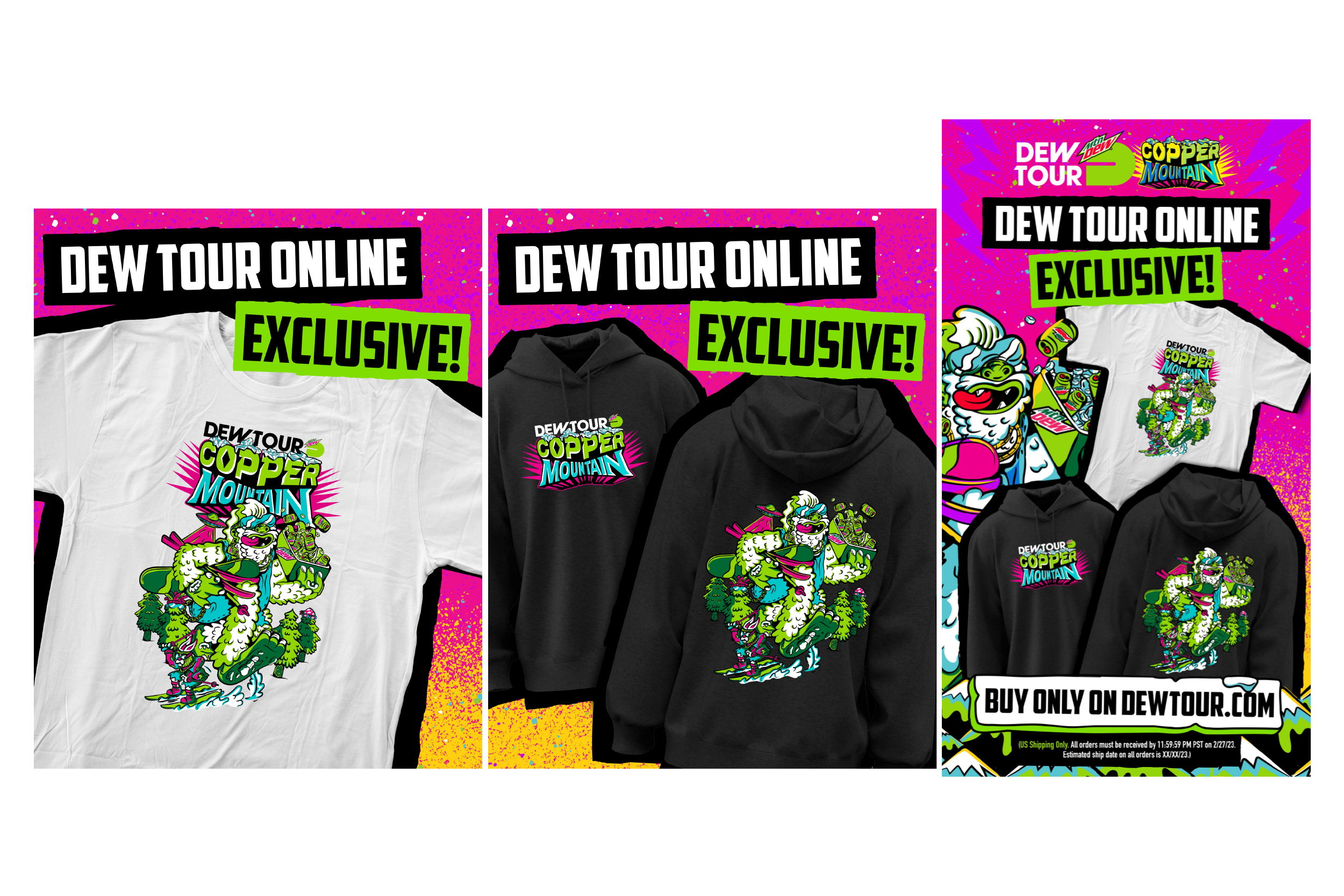
A big part of our overall strategy for Dew Tour was to create a unique offering to spread across both onsite and online. These pieces were to take the key visual toolkit/vis and then build on it to create desirable wearables, premiums and rideables.
We offered both pre-event sale of select pieces and an on-site offering
21K+ in merch sales in 2 days selling out of all pieces.
PRE-EVENT ONLINE OFFERING
Leading into the event we allowed the public to purchase exclusive merch before the event that would not be available onsite and would halt once the Dew Tour kicked off.
Below are social components created alongside onsite banners + thumbnails.
The activation space acts as a hub for all things Dew at Dew Tour - Here we had 5 stations. Spin-to-win, Sampling, Video wall featuring our riders, custom heat transfer station, and merch store.
The activation space acts as a hub for all things Dew at Dew Tour - Here we had 5 stations. Spin-to-win, Sampling, Video wall featuring our riders, custom heat transfer station, and merch store.
To flesh out the takeover of Copper Mountain our team affected surrounding elements of the the event design and course tp bring the established vis to life around the event.
Along with affecting the overall presence at Dew Tour, we were also able to have an impact on the live broadcast.
Our team gave direction on the styling of on-screen graphics displaying information along with the development of live-broadcast animations.
We approached the broadcast animations similarly to the visual toolkit - We developed a hero animation and pulled smaller vignettes to be used across live broadcasts as bumpers and transitions. on-screen graphics
It wouldn’t be a competition without a trophy - we wanted to keep in the Dew Tour spirit and develop a trophy that was not only an object of desire but easy to bring home ( Which was a popular request from our athletes).